
Google’s Fatma Elgendy and Valerie Buyko focus on developing sustainable partner ecosystems across the Middle East and North Africa, delivering data and technology projects to advertisers.
Every day we speak with brands who tell us they spend a ton of money to drive traffic to their websites and apps, only to struggle with frustratingly low conversion rates. This isn’t always bad luck. It often boils down to generic user experience (UX) and user interface (UI) practices, and not really understanding consumer behaviour.
To tackle this gap, we partnered with marketing agency, Incubeta, and UX optimisation agency, Call To Action Digital (CTAD), to run in-depth UX and UI audits and A/B tests across a range of websites and apps. This extensive research covered brands in the United Arab Emirates (UAE), Saudi, and across the globe, spanning the health and wellness, airlines, and financial technology industries.
Our analysis offers us a data-backed blueprint of the UX/UI elements and strategies that consistently make conversion rates rise. And it reveals what is more likely to make consumers click ‘buy’ or ‘sign up’ on a website.
1. Start strong, end strong: Master your website’s entry and exit points
Most people leave a website at the very beginning or end of their journey. In fact, a massive 60% of shoppers in the Middle East and North Africa (MENA) abandon purchases because of payment issues. That’s why it’s crucial to focus a big chunk of your testing and optimisation efforts on landing pages and, especially, on that final checkout experience.
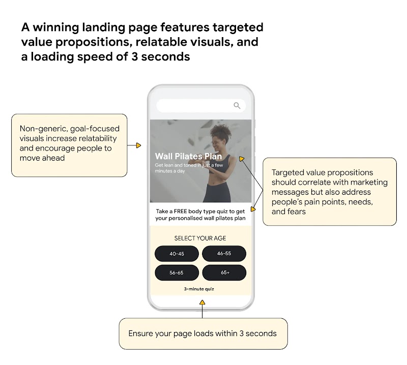
Level up your landing page
Landing pages should match your marketing messages, but value propositions that address consumers’ needs and solve their pain points should be your main focus.
“To encourage action on your website, design landing pages around a narrow, well-defined group of people rather than a broad audience,” says Anna Potanina, founder of CTAD. “These should feature relatable, goal-based visuals, with a loading speed of three seconds. If you’re running multiple campaigns for different audiences, create dedicated landing pages for each and personalise messaging, imagery, and copy. This extra work can really pay off in engagement and conversion.”
Take a wall pilates landing page. It needs to speak to women interested in getting fit and doing at-home workouts. It should offer a simple value proposition, like a free personalised plan based on a quick quiz, and use relatable photos showing women doing wall pilates. To drive action, the site needs to address people’s pain points, for example, reassuring women that the quiz only takes a minute, and they don’t need a credit card. A clear, action-oriented button positioned before the first scroll at the top of the screen, what we call ‘above the fold’, also encourages conversion.
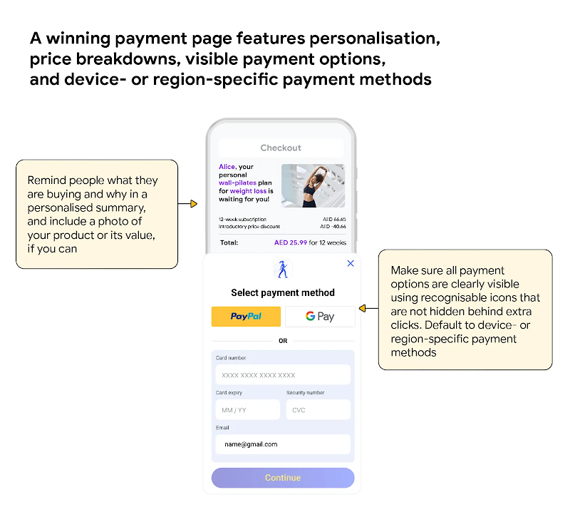
Build a prize-winning payment page
The checkout page is one of the most important components of your website as it’s where people reach the end of their shopping journeys. A personalised message that reminds them what they’re buying and its benefits, paired with a visual of your product or its value, can help drive conversion.
“You can build trust by making payment options visible using recognisable icons that aren’t hidden behind extra clicks,” says Daleen Spence, client service director at Incubeta. “And default to device- or region-specific payment methods to make it easy for people to pay quickly.”
Autofill, which allows a person to fill in a website’s form fields with their saved information, can speed up the checking out process. Shopify found that guest checkouts using autofill had a 45% higher checkout conversion rate (CCR) than guest checkouts without.
2. Choose the most ethical path to conversion
If you’ve shopped online recently, you’ve probably seen brands using fake countdown timers, misleading “was/now” pricing, and fake stock scarcity warnings. These manipulative tactics, known as ‘dark patterns’, are becoming less effective as consumer awareness grows and new regulations take hold. Relying on them damages people’s trust in your brand and makes your business model unsustainable in the long run.
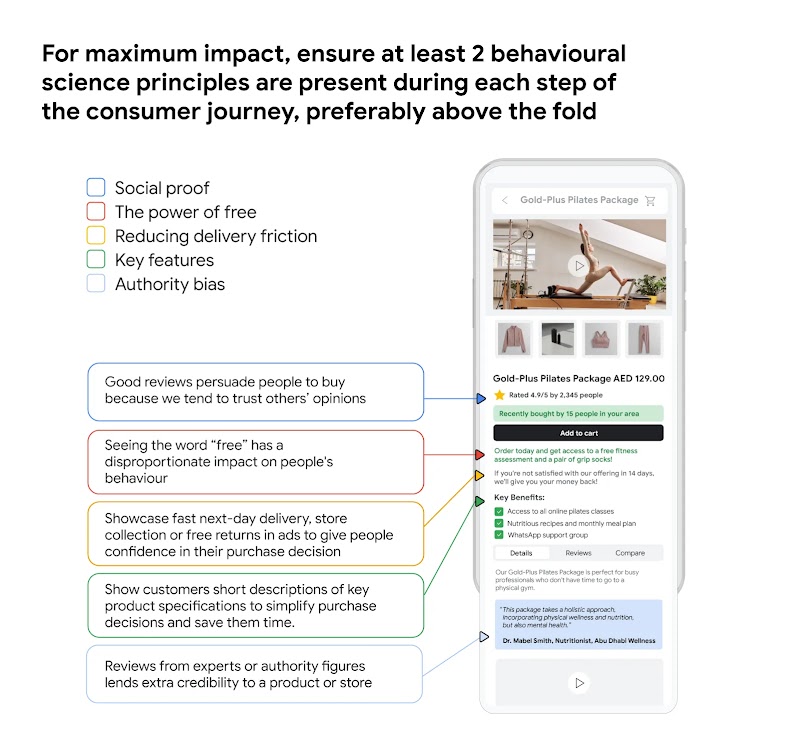
“Applying behavioural science principles and storytelling techniques throughout the consumer journey can deliver comparable results without compromising your integrity,” Spence says. “For maximum impact, ensure at least two behavioural science principles are present during each step of the consumer journey, preferably above the fold.”
In addition to the behavioural science principles in Google’s research, these are particularly powerful on the ethical path to conversion:
Social proof
Good customer reviews persuade people to buy because we tend to trust others’ opinions. Research shows that this is the most powerful principle for counteracting discounting.
Endowment effect
This means giving people a sense of ownership through free trials, samples, or even customisation. This cognitive bias makes us value something more highly because we feel like we own it.
Customer as the hero
Make your customer the hero of the story instead of focusing only on product features. Position your brand as the trusty guide that helps people overcome a problem to achieve a positive outcome.
3. The UX non-negotiables: Clarity, consistency, and error prevention
There are three basic, but essential, usability principles to keep in mind when designing a website. We all subconsciously expect to see them. When they’re missing, this can create cognitive friction, meaning mental effort that can cause frustration and make someone leave a website.
By regularly mapping and auditing visitors’ website journeys against these core usability principles, you’ll reduce mental friction, build trust, and guide people naturally toward taking action, whether that’s signing up, purchasing, or engaging more deeply.
The UX non-negotiables are:
ClarityPeople should always understand what’s happening on your website and what to do next. Clear language, intuitive labels, understandable visual icons, and immediate feedback, like a confirmation notification when someone adds to their cart, prevent confusion.
Consistency This makes the website experience predictable, building trust and familiarity. For example, navigational elements should always stay in the same place across pages, and recognisable icons should always have the same meaning everywhere.
Error prevention This anticipates potential mistakes before they happen. It can include confirmation prompts that ask “are you sure you want to delete this?” before a visitor takes action. Other examples include helpful hints that guide people towards the right action, or greying out buttons that aren’t in use.
In a nutshell: Move beyond guesswork to boost conversions
Boosting website conversions isn’t about guesswork or manipulative tactics. It’s about building trust through mastering your landing pages and checkout experience.
This means choosing ethical behavioural science and storytelling principles, and applying the UX trifecta of clarity, consistency, and error prevention.
Combining all of these elements creates a smoother website experience that can convert visitors into loyal customers likely to buy more.
Need advice to help you boost app conversions? Read ‘Beyond the download: 3 simple design steps to build long-term app loyalty'.


Social Module
Share